The meat of the CTA may be in the text, but when it comes to Facebook ads, visuals are arguably the most important factor.
Scrolling down their Facebook feeds looking for something interesting, it's all too easy for your audience to skip right over your paid ads.
You have to be able to grab their attention, in less than a single second.
Images are great for that.
Humans can perceive them and process them very, very fast, making them a great tool for getting people to look your way.
The last thing you want in a Facebook ad is boring imagery.
You need something that stands out.
This can mean using colorful clipart and iconography.
It could also mean using an image where a significant amount of human skin is visible.
(Not in an inappropriate way. But skin does draw the eye toward an image.)
One of the easiest ways to make your Facebook ad pop, though, is simply to use a dark background.
A recent blog post from Wishpond explains why.
Dark & Bold Backgrounds Pop On Facebook
Most of the popular social networks like Facebook, Twitter and LinkedIn utilize a very light color or even white scheme.
This helps it look great on nearly every screen but also limits the colors you can use in a Facebook visual.
If you are using a light Facebook ad image it is just going to blend into the background.
And your user will not even see it as they scroll through their feed.
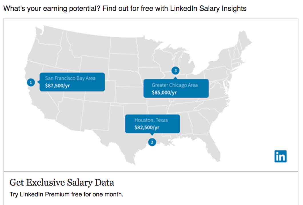
Like this example from a company that really should know better:
[image source: Wishpond]
The most eye catching color there is a blue that is way too similar to Facebook's own blue.
This ad is likely to be completely glossed over by their target audience on Facebook.
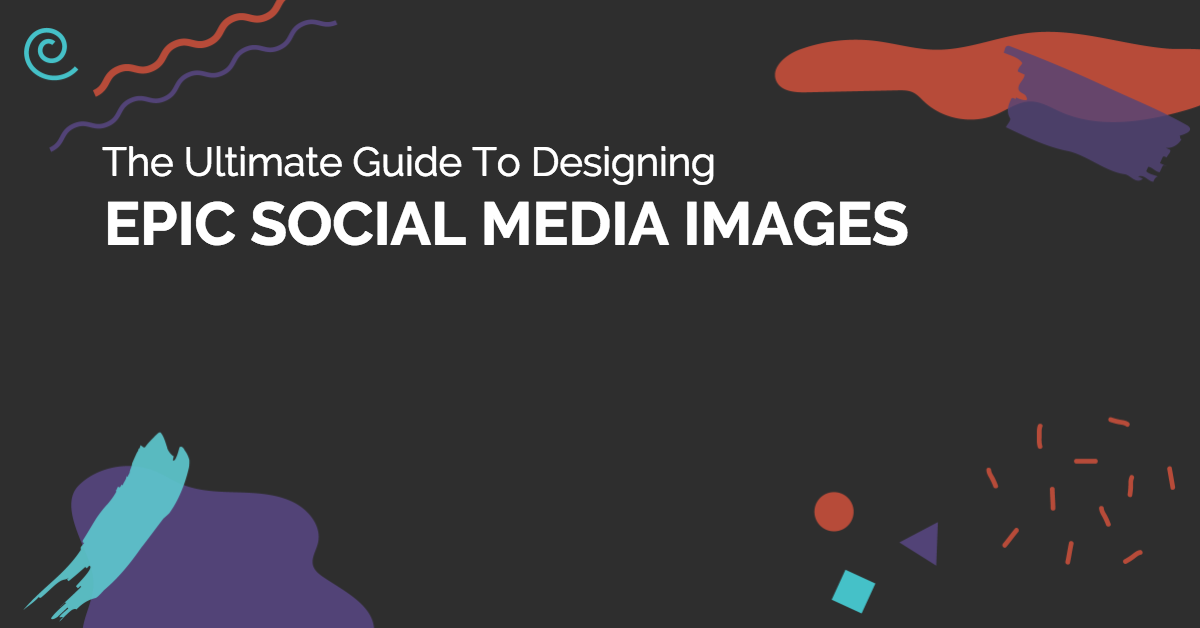
Instead you want to use a dark or bold background.
[image source: Wishpond]
Ads like this one (dark bold), will pop off the Facebook feed and grab a user's attention like no other light background ad could.
You can find more great advice about how visual design can boost your Facebook Ad conversions over at Wishpond.
CHALLENGE Yourself to Profit!
Free Download: Build Your Profit-Generating Online Business With This Free Blueprint
Sign Up, follow the easy steps and You'll get the tactics, strategies & techniques needed to create your online profit stream. It's free!
[adrotate group=”6″]
[adrotate group=”5″]


